REDESIGNING AN AI FACE REDATION TOOL

Solutions and Hypothesis Proposal
What can we make that will solve the business problems and the needs of our users at the same time?
Prototyping design alternatives
Based on the learnings from the user interview and competitor analysis, I proceeded to elaborate on different solutions keeping in mind some of the pros and cons from each of the approaches.
To evaluate the final designs, I conducted usability testing with seven users representing varying levels of expertise with the redaction API. I ensured the inclusion of new users to assess the tool’s discoverability without relying on external support like documentation or tutorials.
During these tests, I emphasized the importance of observing users’ thought processes before any clicks. I also informed them that certain interface areas might be non-interactive due to prototype limitations, encouraging them to describe their expected interactions.
Through these tests, we observed that users had a clearer understanding when interacting with the second prototype. The streamlined structure and simplified steps allowed them to navigate the interface more intuitively, leading to a smoother and more confident user experience.
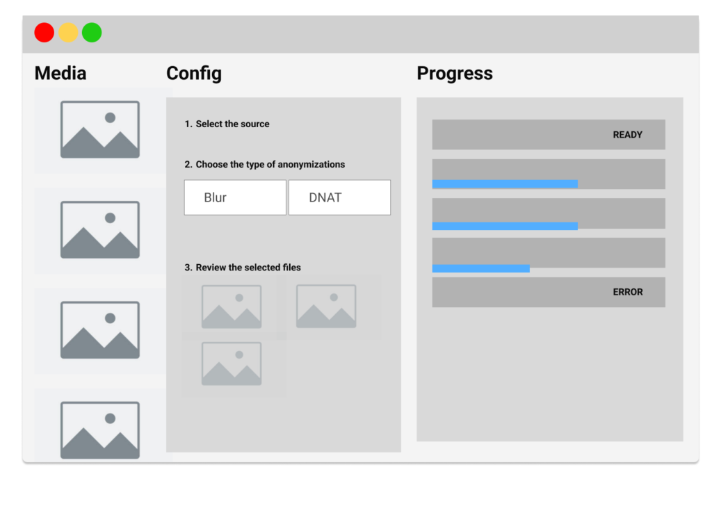
Proposal 1 Based on the Adobe Media Encoder interface
I proposed this layout, inspired by Adobe Media Encoder, as the main screen for users to process their files. The goal is to provide a simple layout that allows users to upload and manage their files quickly and easily. This type of interfaces are most likely prefered by expert users that already know how to integact with video editing softaware where the main priority is to have an efficient proces.
Testing the proposal 1
5
Total Users Tests
4
Users understand where to upload files
3
Users know what each configuration is
3
Users liked the experience
Proposal 1 Main Takeaways
Pros:
- Internal stakeholders found it easier to manage large amounts of content.
- Users felt the software was familiar since it closely resembled existing tools.
Cons:
- The experience still requires a certain level of expertise, as users need to decide when to switch configurations. Users unfamiliar with the process might not understand what “Deep Natural Anonymization” is, which limits solving the second challenge mentioned.
- This approach leaves little room for users to fully understand the different configuration options.
- It raises the question: Why would users choose our tool if it’s so similar to the existing ones?
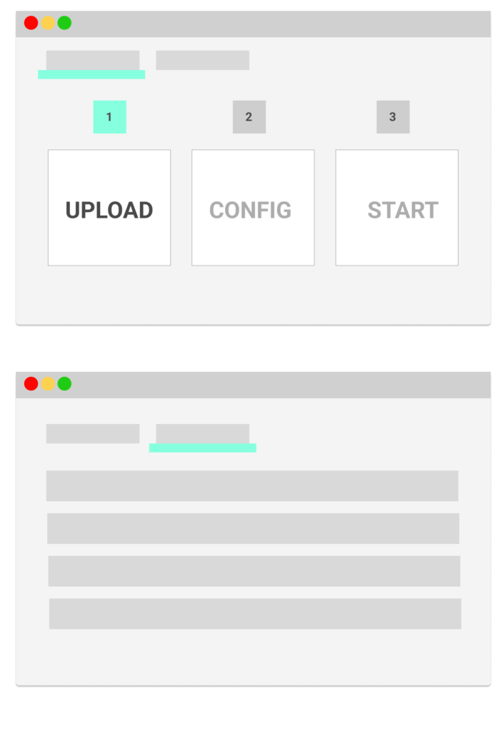
Proposal 2 Guided Experience Based on Three Easy Steps
Testing the proposal 2
5
Total Users Tests
5
Users understand where to upload files
5
Users know what each configuration is
5
Users liked the experience
Proposal 2 Main Takeaways
Compared to the first prototype, users interacting with the second prototype showed less hesitation in engaging with the interface, as it took them less time to comprehend the layout.
The clear, linear flow of three distinct steps was immediately apparent, which contrasted with the grid-based approach of the first prototype, where the progression was less intuitive.
This simplified structure helped users feel more confident and guided in their actions.
Pros:
- Easy to Follow: The UI functions like a wizard, guiding users step-by-step. However, it’s flexible, allowing users to reconfigure at any stage. For instance, users can upload more pictures in step 1, even after completing step 2 (configuring the tool).
- Highly Visual: The interface is intuitive, requiring minimal reading. During testing sessions, users understood they had to complete three steps simply by looking at the visual cues in the UI.
- Self-Explanatory: The tool serves as a marketing component by being easy to use and showing a quick routine that is simple for users to learn.
- Discovery: Exposing the configuration (step 2) helps users naturally discover the anonymization options and explore them.
Cons:
- We risk the user having a slow process


Let’s work together on your
next web project
Send a message and let’s start shaping the future of your product.