INTEGRATING PROCESS MINING WITHIN APPIAN

Solutions and hypothesis proposal
Competitor Analysis
The Chief UX Designer at Appian assigned me to conduct a comprehensive analysis of existing process mining tools available in the market. This analysis aimed to identify industry best practices, understand the competitive landscape, and inform our design decisions.
Based on Appian’s core values, I ensured that the analysis adhered to ethical guidelines and compiled a document outlining the key features of each competitor:
- Ease of Use: A primary focus was on identifying tools that were easy to understand and navigate for non-technical users.
- Process Diagram as a Central Element: Recognizing the importance of the process diagram, I paid close attention to how each tool visualized process flows, including the level of detail, interactivity, and overall clarity.
- Customizable Interactions: I analyzed the availability and effectiveness of custom components that allowed users to interact with the process diagram in meaningful ways, such as filtering, highlighting, and drilling down into specific areas.
- AI-Powered Insights: I investigated the integration of AI capabilities within each tool, such as automated anomaly detection, predictive modeling, and the use of AI to assist users in understanding complex visualizations.
- User Experience (UX) Design: I evaluated the overall user experience of each tool, considering factors such as usability, accessibility, and the overall aesthetic appeal of the interface.
This competitive analysis provided valuable insights into the strengths and weaknesses of existing process mining tools, informing our design decisions and ensuring that Appian’s solution would offer a unique and competitive advantage in the market.
As noted in the project ‘Redesign of the Brighter AI Anonymization Software,’ I find it essential to observe my daily tools and identify analogies in applications that may initially seem unrelated to the process mining field.
From this analysis, I’d like to highlight how I was among the first designers in the Appian UX team to identify similarities between Google Maps and the process diagram. I will soon be publishing a project I led to enhance the process diagram component by applying design principles found in Google Maps.

Andreas Hock
Senior Solutions Consultant @ Appian Process Mining
“I meet Javier by accident in the Berlin office. As Senior Solutions Consultant I’m not very often in the office. We instantly found ourselves in a discussion about a real live process mining situation with an existing client and how this client could benefit from the new Mining HQ. Javier was very interested to learn about what is driving real customers and how we could support them. He also demonstrated a deep understanding as he showed me a Google Maps like visualisation of mining data. This exactly was what I’ve discussed with the client a couple of days before. Javier proactively developed an idea which could be, as a product feature, exactly meets a business demand. Javier definitely has a very good understanding of what could be of interest for customers, how to drive and visualise ideas and, most importantly he’s interested in what really matters for our customers.”
Low fidelity mocks
As mentioned, business analysts are the end users of the process mining capabilities. They require easy access to process data and language that aligns with the executive interactions they encounter daily.
My goal as a designer is to help create an interface that seamlessly integrates with the overall Appian workflow and guides business analysts through a clear process, helping them identify areas that need improvement.
The previous interface offered a less guided user experience. A side navigation organized cryptic pages, requiring users to have prior knowledge to effectively utilize each interaction. Even within the team, many members required additional guidance on how to use the interface effectively and when to choose specific visualization types.
Observing the customer success team (working with Jonas Bernien) guide me through a use case was incredibly valuable. They demonstrated how to query specific data points from the process and explained the rationale behind their approach.
Drawing upon insights from the interview rounds and considering the Appian target user group, my team and I developed a series of user flows that aligned with our design assumptions.
Creating low-fidelity mockups accelerated our team’s progress. I leveraged my presentation skills to convey clear ideas without excessive resources. This enabled our team to explore a wide range of possibilities and make informed decisions in a project filled with uncertainty. Low-fidelity mockups communicate our ongoing refinement of general details. Most importantly, they address the primary challenge of finding a system to sort suggested areas of improvement, helping non-experienced users quickly identify the types of cases that significantly impact their process.
For the business analyst flow, we identified the following stages of realization that we would need to guide them through using an intuitive series of interfaces.
- How can we help the users drill down into specific subsections of the process?
- What are relevant visualizations to display at this stage?
- How should we call these subsections so they make sense to them?
- What are the key concepts that will help the user understand their data?
In many use cases analyzed by our team, we found that users frequently apply additional filters to process data to focus on specific areas. For example, they might filter cases that are already closed or those occurring in a particular business region.
At this stage of the user flow, the user is more focused on understanding their process rather than investigating it. I won’t delve into this stage in detail, as my primary focus is on the area where I contributed the most.
Business analysts seek to understand the current performance of key performance indicators (KPIs) and the actual shape of their process, often finding significant discrepancies between reality and their planned business operations.
To streamline the scope and simplify user flow design, our team concentrated on the average case duration KPI. However, we were mindful of ensuring that the resulting user flow could be adapted to accommodate any KPI.
Considering a user focused on reducing a high average case duration in their process, my objective was to design an interface that clearly highlights the areas where business analysts should direct their attention. It was at this stage of the project that we confronted the most challenging question to address.
How do I as a user know that I am focusing on the most relevant data?
The primary goal of investigating the case average duration is to identify which cases are experiencing delays. However, with a large dataset containing thousands of cases, how can we systematically pinpoint areas for improvement?
We knew we wanted to offer a list of suggested areas for exploration. To achieve this, our team developed an algorithm that would compare all relevant data subsets and identify those with a significant impact on the KPI the user is targeting.
Through multiple iterations, we experimented with various approaches to address this question. I find it interesting to trace the evolution of simplicity throughout the different stages of this design.
First iteration
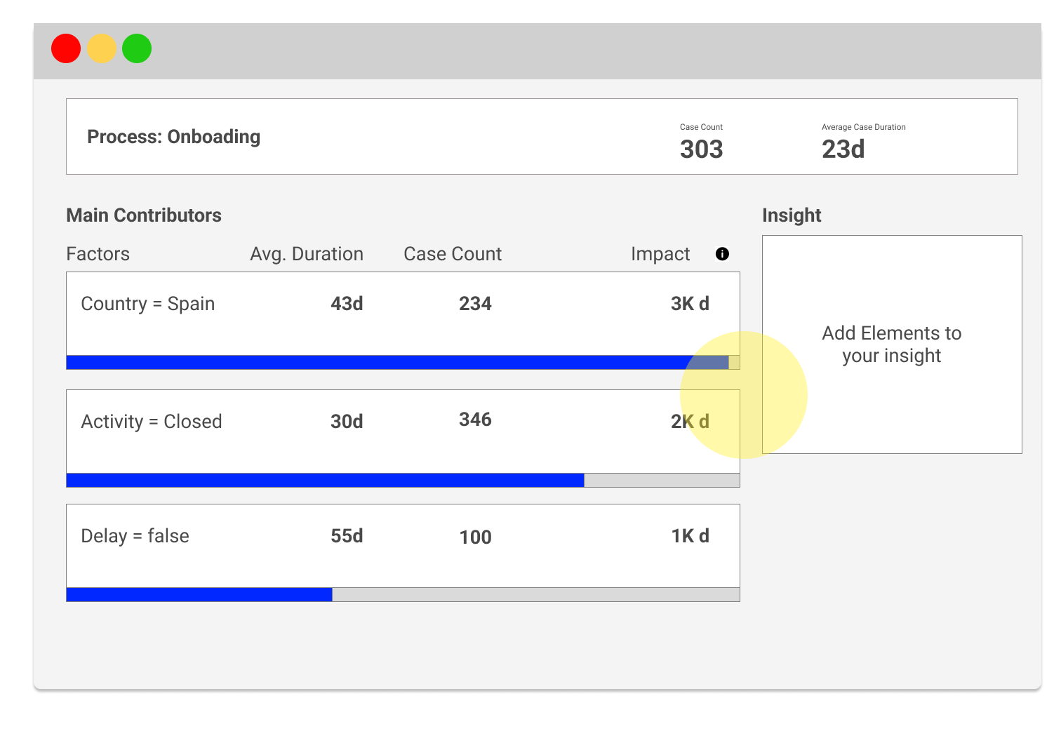
Concept: A list of suggestions sorted by estimated annual savings, displaying a set of metrics for each item.
- Pros:
- Users had access to all necessary metrics on the screen to comprehend the sorting logic. For example, the first element appeared at the top because, despite having fewer cases than the second, its average duration from the subset of cases was longer, resulting in higher annual savings.
- Cons:
- Even technical users became overwhelmed by the sheer number of metrics displayed on each row.
- Our reliance on tooltips negatively impacted the overall simplicity of the page.
- Action items:
- We need to find a clear sorting method for the list without relying on excessive data points, simplifying the overall interface.
Second Iteration
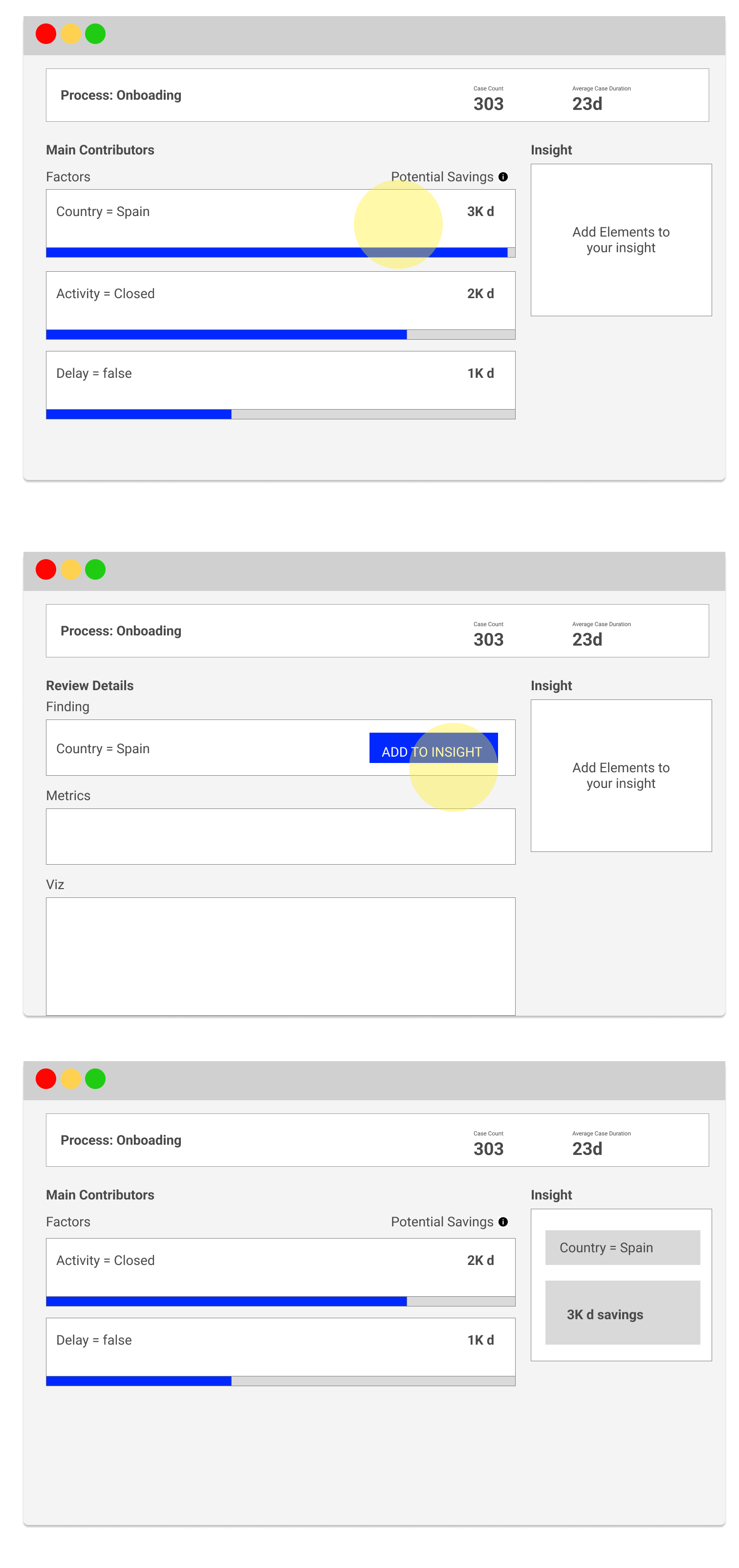
Concept: I proposed to improve progresive disclosure by only showing potential savings as the main metric that defines the importance of each element. Notice how we decided to switch from “Impact” to “Potential Savings”. I supported the infoDev team to come up with this concept, since we wanted to better exposed what is the number highlighting (The amount of days that you would have saved if the data set you are looking at would have performed as your average cases).
- Pros:
- The list is easier to digest now since we are presenting less elements on the list.
- Cons:
- The “Potential Savings” number is not easy to understand for users that are not familiar with the tool.
- Users don’t see the main metric –> Average Case Duration
- Action items:
- We need to make the main KPI more prominent.
- We need to find a new metric to help user understand how are we sorting the list.
How can I, as a user, understand which areas of the process I am focusing on?
As a business analyst, it’s logical to focus on the larger segments that most significantly slow down the process. To identify patterns in the data, process mining tools rely on all the metadata attached to each case.
Many concepts are used for clustering, but here we will focus on the most relevant ones identified by the former customer success team at Lana Labs:
- Activities: In business process management, tasks or actions taken by humans or machines that result in a process.
- Sequences: The order in which activities occur in a process, which can reveal patterns or bottlenecks.
- Repetition: Activities or sequences that occur multiple times within a single case, potentially indicating inefficiencies.
- Attributes: Attributes are additional metadata points tied to a case, such as location, department, or product type. These often help uncover trends across specific subgroups of cases.
- Duration: The total time spent on a case or a specific activity within it. Longer durations can indicate delays.
- Volume: The number of cases or activities within a particular process. High volumes in specific areas might highlight opportunities for improvement.
In general, Lana Labs’ customer success team historically used these parameters to identify a significant subset of cases with notably longer average resolution times than the overall population. For instance, if Spanish closed cases were resolved five days slower than the global average, they might be a prime group for further investigation.
These properties help highlight and give meaning to specific areas of a process. It is crucial for users to understand each concept fully so they can accurately identify the relevant groups of cases. For expert analysts like those on Lana Labs’ customer success team, these terms were part of their everyday language. However, considering non-experienced, brand-new users, I quickly raised the concern with my team that emphasizing such complex concepts could discourage them from engaging with the interface.
This was evident in the early prototypes, where users were presented with a series of tabs containing different types of suggestions. During user testing, we observed that less experienced users struggled to distinguish between these tabs and, as a result, couldn’t grasp the rationale behind the separation.
At this stage, we had two potential hypotheses to guide the design implementation.
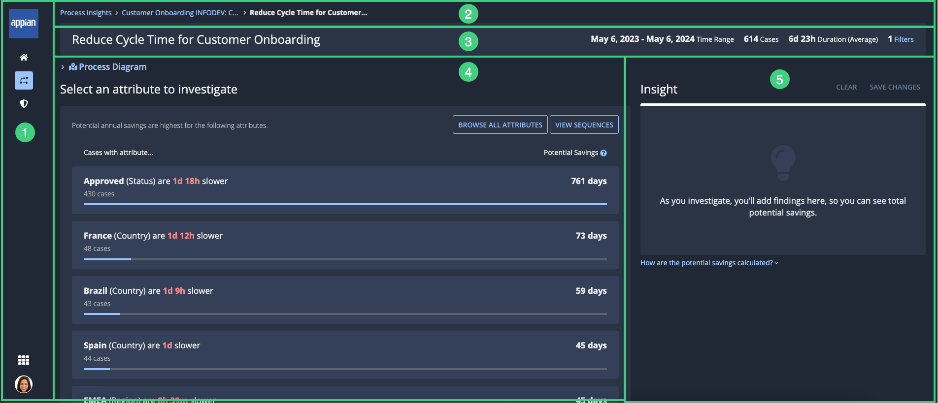
Hypothesis 1: Separate the suggestions into two dimensions:
- Types of cases that are slow
- Parts of cases that are slow
This design was based on the assumption that the targeted users might still want to decide if they prefer focusing on a specific segment of their process (e.g., certain types of cases) or attributes attached to the case (e.g., geography, product line).
In this second iteration, I proposed to make the KPI more obvios to the left of the screen (before it was in the header where people would ignore it).
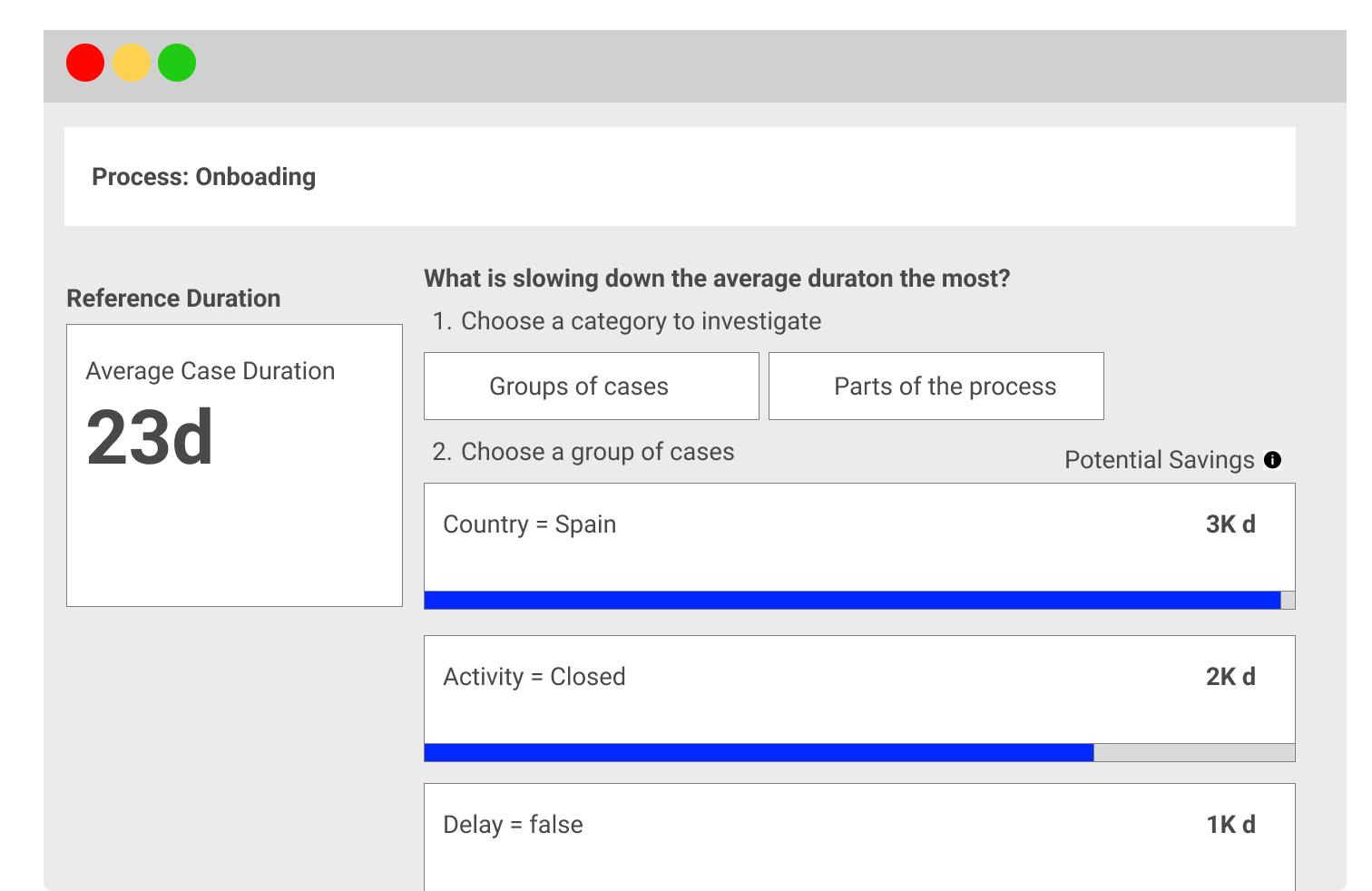
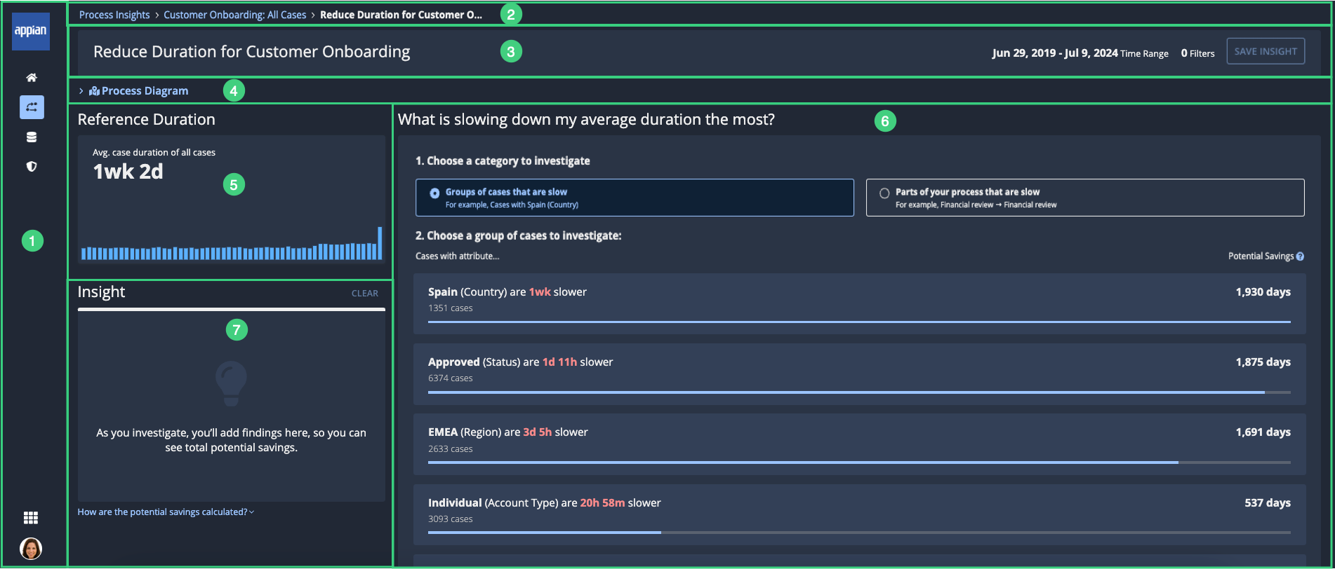
Hypothesis 2: Simplify and present suggestions in a single list without separating them into dimensions.
This approach suggests that users may not require detailed specifications about the suggestion beyond the key name that indicates the data segmentation and its overall process impact.
Evolution of the Design Thinking Process
Over six months, we iteratively tested these approaches with users and gathered feedback to refine the design. Here’s a summary of the key stages:
- Initial Prototype: Tabs were used to group suggestions by dimensions (types and parts of cases). While experienced analysts found this structure intuitive, newer users were overwhelmed and avoided engaging deeply with the tool.
- User Testing Feedback: Users emphasized the importance of clear, actionable insights without needing to navigate complex categories. They preferred seeing a list of suggestions with clear impacts rather than understanding the segmentation behind them.
- Simplified Presentation: Based on feedback, we moved toward a unified suggestion list. The interface emphasized key information, such as the segment name, impact on the overall process, and recommendations for improvement, without overwhelming the user with technical details.
- Current Implementation: The final design balances simplicity and depth. Users are presented with a prioritized list of suggestions, where each suggestion is labeled with a clear key name (e.g., “Spanish Cases – High Duration”) and a short explanation of its process impact. Advanced users can drill down into metadata like activities, sequences, or attributes if they wish, but this information is hidden by default.
I will be soon sharing the most recent iteration for 25.1


Let’s work together on your
next web project
Send a message and let’s start shaping the future of your product.