
MVP Definition and Implementation
Dark Theme & Scalable Design System Components
I led the implementation of dark mode and reusable components, enhancing usability and consistency across the platform. By leveraging the foundational color system and key UI elements (e.g., KPI previews, charts, insights modules), I ensured accessibility compliance (WCAG contrast ratios, semantic markup) while maintaining design integrity.
To streamline development, I created structured design tokens, Figma libraries, and documentation, enabling seamless handoff. I also used SAIL as the source of truth, specifying accessibility requirements and responsiveness. My technical understanding allowed me to anticipate real-data interactions, ensuring scalability and a cohesive user experience.
Take a look to this presentation that shows the result of the integration of Process Mining within the Appian Plaform (24.3 version)
A big part of the discussion centered on accessibility and responsiveness. I explained how those elements were built into the design from the start, showing how they could boost visibility and broaden user adoption. I made it clear that transparency was a priority. I wanted the team to know I was available for ongoing support, encouraging them to reach out with questions as they worked with the mockups. That set up a solid feedback loop, which was crucial for iterative development.
To keep things organized and transparent, I created a Feature UX Overview document that linked every design element directly to its Jira ticket. This became the team’s single source of truth. I also carved out time to regularly review those tickets, making sure each had clear specs and links to relevant design components to minimize confusion and keep the team moving efficiently.
Sprint planning was key too—it gave us a chance to align across the team, remove roadblocks, and confirm that we were still on track to meet user needs and hit MVP goals. Plus, it was a great opportunity to clean up the backlog by closing out outdated or irrelevant tickets.
I also held regular office hours where developers could drop in with questions or to discuss implementation challenges. That open-door approach made a real difference in keeping design decisions clear and ensuring they were implemented smoothly. This continuous feedback and collaboration helped us evolve the design quickly and deliver a strong MVP that met the needs of Appian users.

Frank Li
Product Manager Head of Ops at Snowball
“Javi is an exceptional talent, blending strong UX skills with speed and organization. He can turn around a concept quicker than just about anyone I’ve worked with at Appian. He’s also very adaptable, and can be effective in many different environments. He also brings a positive energy to work all the time and is a great collaborator!”
What to know about me
I had the incredible opportunity to attend the Brad Frost Master Class, hosted by the phenomenal team at Hatch Conference. A day filled with insights and learning directly from the author of Atomic Design himself was beyond inspiring!
The master class was an eye-opener, providing me with a plethora of learnings and new perspectives. It’s incredible how a single day can fuel so much inspiration and add immense value to my approach in the design field.
Thank you, Appian, for making this opportunity possible, and thank you, Brad Frost, for sharing your expertise and insights. Looking forward to implementing these new learnings and concepts in my work ahead!
I led the charge on implementing dark mode and reusable components to improve usability and consistency across the platform. Working from the core color system and key UI elements like KPI previews, charts, and insights modules, I collaborated closely with developers to ensure everything met accessibility standards—think WCAG contrast ratios and semantic markup for screen readers.
To streamline the design-to-dev process, I built out detailed design tokens, Figma libraries, and documentation, making it easier for engineers to integrate components without sacrificing design integrity. For example, I designed the dynamic KPI component and container hierarchy with scalability in mind, so they could flex across different workflows.
Beyond the visuals, I pushed for tight feedback loops with engineers to fine-tune interactions, like improving empty states in the ‘Findings’ panel for users new to process mining. This balance of aesthetics, technical feasibility, and inclusive design is what excites me about Vinted’s mission—scaling a design system that empowers both designers and developers to create seamless, high-quality experiences for users worldwide.
a!headingField(
    text:"Heading 1",
    fontWeight:"REGULAR",
    size:"LARGE",
    color:"STANDARD",
    marginAbove:"STANDARD",
    marginBelow:"STANDARD",
    headingTag:"H1,
),
a!headingField(
    text:"Heading 2",
    fontWeight:"REGULAR",
    size:"MEDIUM",
    color:"STANDARD",
    marginAbove:"STANDARD",
    marginBelow:"LESS",
    headingTag:"H2,
),
a!headingField(
    text:"Heading 3",
    fontWeight:"BOLD",
    size:"SMALL",
    color:"STANDARD",
    marginAbove:"STANDARD",
    marginBelow:"LESS",
    headingTag:"H3,
),
How I contributed to create the dark mode for Appian.
Since Appian only had a light mode, designing dark mode wasn’t just a UI tweak—it meant rethinking the entire color system from scratch. I worked closely with the UX team to explore alternative palettes that balanced accessibility, brand consistency, and visual clarity. Through multiple iterations, we tested different color schemes to see how they affected contrast, data legibility, and overall usability. Here are two directions we explored before landing on the final implementation
Final Decision
We chose these colors for dark mode to ensure accessibility, brand consistency, and usability. The deep background (#1A1F27) and layered containers (#2A3445, #334057) reduce eye strain while maintaining hierarchy. Vibrant accents like the CTA (#82F0D7) and Turbo Purple (#BD9BFE) align with brand identity and ensure clarity.
a!localVariables(
    local!primaryColor:"#82F0D7",
    local!background:"#1A1F27",
    local!parentContainer:"#2A3445",
    local!childContainer:"#334057",
    local!error:"#F35C5C",
    local!succes:"#5CFFC5",
    local!warning:"#FFDA5C",
    local!purple:"#BD9BFE",
5CFFC5
)
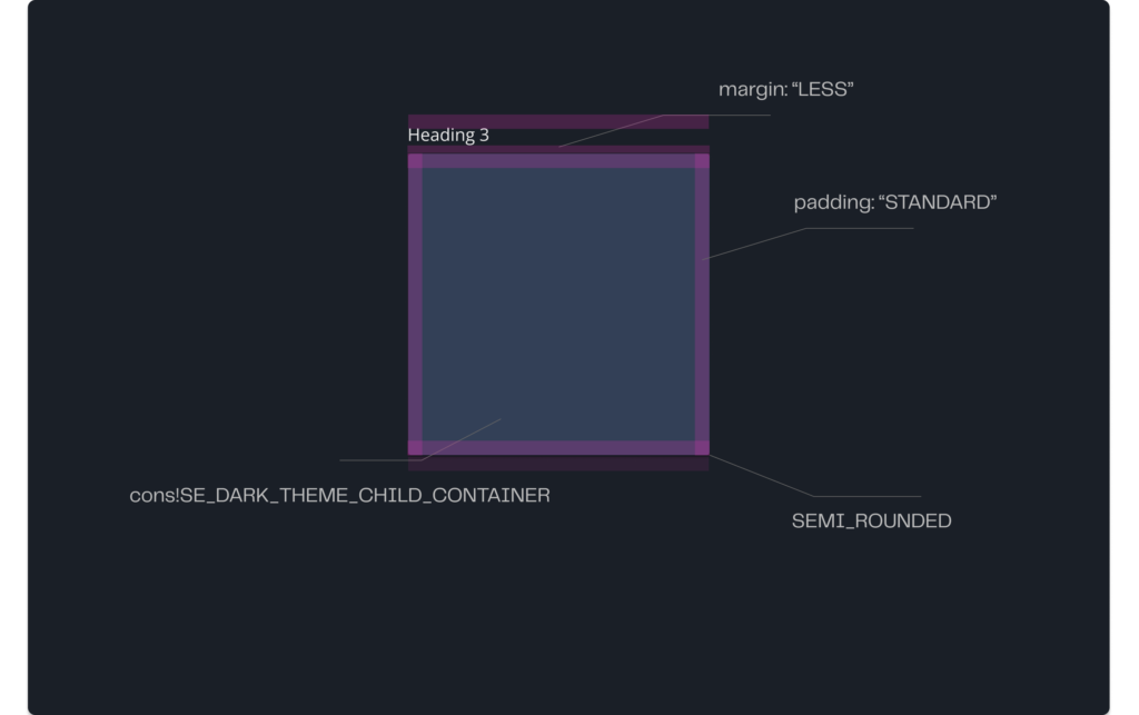
Containers
I played a key role in designing and implementing the Sail Component, a reusable container template for process mining insights. Containers are foundational UI elements that organize and structure content within Appian Process HQ, ensuring clarity and consistency across the platform.
Parent Container: Use #2A3445 as the base layer to group related components. It provides a clear visual boundary and organizes content logically.

a!headingField(
    text:"Heading 2",
    fontWeight:"REGULAR",
    color:"STANDARD",
    marginAbove:"STANDARD",
    marginBelow:"LESS"
),
a!cardLayout(
    style:cons!SE_DARK_THEME_PARENT_CONTAINER,
    shape:"SEMI_ROUNDED",
    showBorder:false(),
    marginBelow:"STANDARD",
    contents:{
    }
),
Child Container: Nest within parent containers using #334057 to differentiate sub-sections while maintaining cohesion. This ensures users can quickly identify relationships between elements.
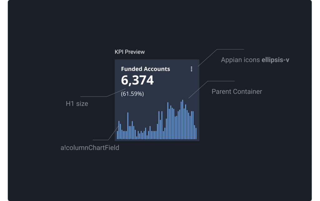
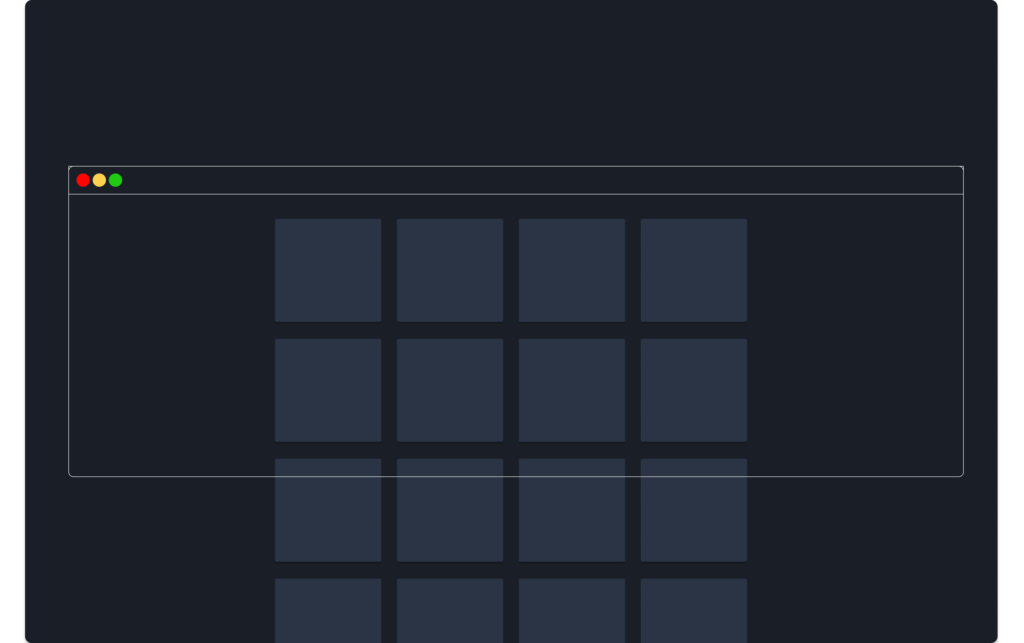
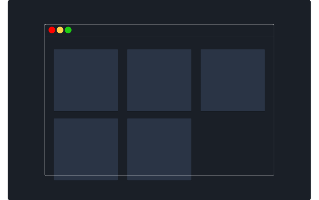
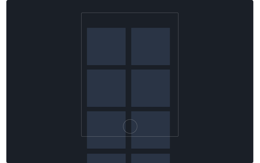
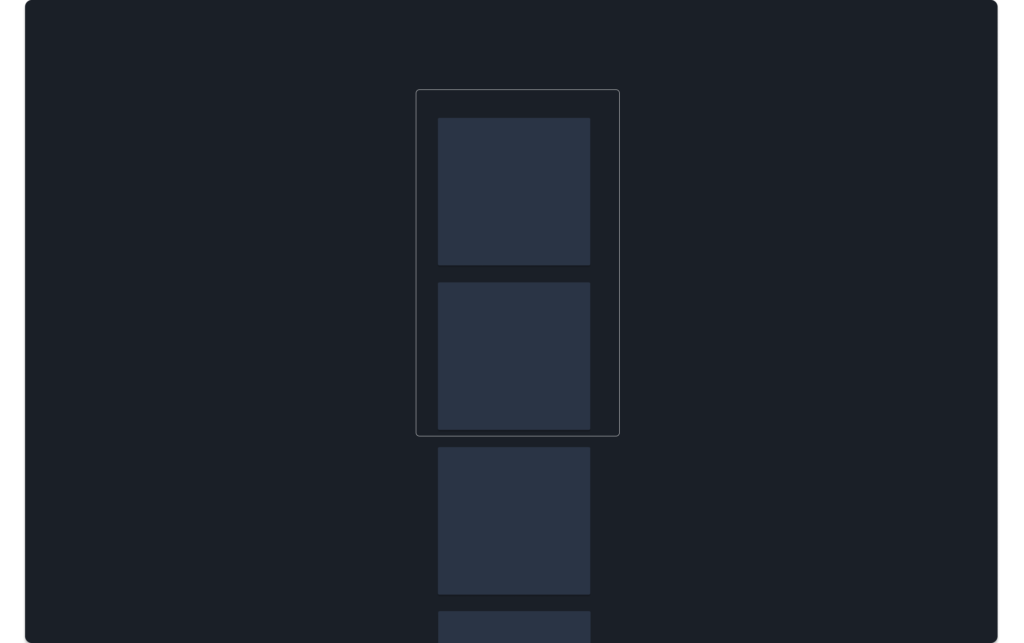
KPI Component
- Primary Purpose: Display critical metrics (e.g., financial savings, user adoption) in a scannable format.
- Hierarchy:
- Title:
Heading 3(e.g., “Funded Accounts”). - Value: Large, bold text (e.g.,
32px, #2A6FDB). - Subtext: Contextual details (e.g.,
(81.72%)in14px, #6C757D).
- Title:
- Layout:
- Place high-priority KPIs at the top-left of containers (follows F-pattern reading).
- Group related KPIs (e.g., financial metrics) in the same parent container.
- Desktop to Mobile Adaptation:
- Desktop wide – 4- column grid with
24pxspacing centering the content - Desktop: 3-column grid with
24pxspacing. - Tablet: 2-column grid; reduce title font to
16px. - Mobile: Single column; stack value and subtext vertically.
- Desktop wide – 4- column grid with
- Text Scaling:
- Use relative units (
em/rem) for fonts to support browser zoom. - Avoid fixed widths; let containers expand with screen size.Icon Placement:
- Use relative units (
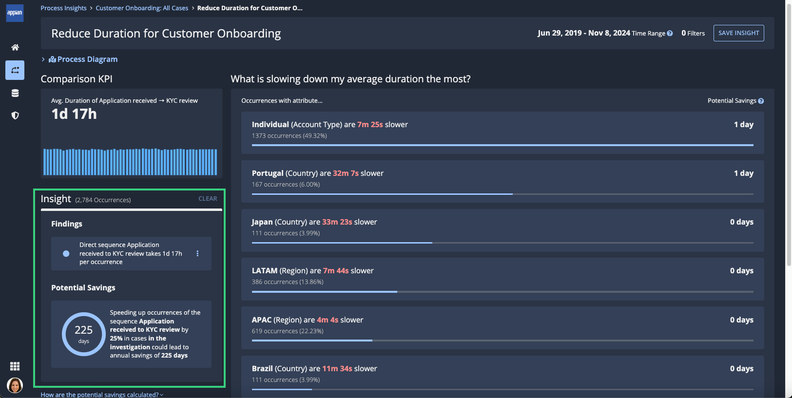


Designing and Deploying Enhanced KPI Management in Appian Process Mining
After contributing to the implementation of the beta version of process mining capabilities within Appian, I played a key role in the productization of Process HQ—Appian’s out-of-the-box tool that empowers business users with actionable insights into their processes.
In this project, I will take you through the design process I led to implement the custom KPI creation flow, supporting business users in defining and visualizing process-specific metrics.
Learn more about how I applied the design process in this project

Let’s work together on your
next web project
Send a message and let’s start shaping the future of your product.