A UX APPROACH TO SIMPLIFYING COMPLEX PROCESS VISUALIZATIONS

MVP Definition and Implementation
First Increment and Continuous Improvements
For the first increment, we aimed to quickly validate whether the simple/complex model could solve the user needs framed in our hypothesis. The primary goal was to ensure users understood the different levels of process complexity and found this approach more intuitive than the variant group slider. To keep the approach lean, we implemented the minimum viable solution for complexity filtering.
Ideally, I wanted to replicate the slider from the Lana Labs tool, but SAIL’s limitations prevented us from building such a component without extensive development. Given time constraints, I proposed a tab-based interaction instead. After securing approval from the UX Chief, I collaborated closely with Brett Blue (From the info dev department) to define five distinct concepts to name the complexity levels.

Brett Blue
Senior Technical Writer @ Datadog
“Working at Appian with Javi on our Process HQ beta initiative was exceptional. He consistently transformed complex user flows into elegant, intuitive experiences while skillfully balancing stakeholder needs and tight deadlines. His collaborative approach and ability to incorporate feedback made him an invaluable partner in creating a seamless user experience on this mission-critical project.“
User Testing Insights
Testing revealed that users found it helpful to switch between tabs and better grasp how simpler versions of the diagram filtered out less frequent activities. However, they expressed the need for a clearer way to comprehend the full complexity of the process diagram.
To address this feedback, I suggested redesigning the legend, a solution that was well-received by the UX Chief for its minimal resource requirements.
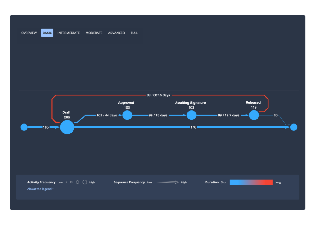
Legend Improvements:
- Activity Size: I used a gradient of unfilled circles, increasing in size from left to right, to indicate activity volume.
- Sequence Size: I incorporated an arrow graphic that transitions from thin to thick, visually representing changes in sequence density.
- Color Gradient: Instead of the two static colors used in the previous tool, I introduced a smooth gradient to represent complexity levels. This change significantly reduced the time it took new users to understand the relationship between activities.
These adjustments made the process diagram more intuitive for users, including those familiar with Lana Labs, who acknowledged that it now made more sense.
Ongoing Initiatives
I continue to lead the effort to improve the process diagram experience, collaborating with a dedicated team at Appian. Key focus areas include:
- Refining Visual Hierarchy: Ensuring important elements are more easily distinguishable.
- Design Simplification: Identifying ways to communicate more with fewer elements.
- Integrating Google Maps Analogy: Exploring how to adapt this layered interaction approach to the process diagram for better user comprehension.
These ongoing improvements are driven by continuous user feedback and aim to provide a scalable, intuitive solution for understanding complex processes at a glance.
Keep posted for upcoming projects talking more about how I am enhancing the process diagram at Appian Process HQ 🚀


Integrating Process Mining within Appian
Appian is a software company that automates business processes. The Appian AI Process Platform includes everything needed to design, automate, and optimize even the most complex processes, from start to finish.
I was hired to support the implementation of process mining capabilities within the platform, enabling users to improve their business outcomes using process mining methodologies without needing a technical background.
Learn more about how I applied the design process in this project

Let’s work together on your
next web project
Send a message and let’s start shaping the future of your product.