REDESIGNING AN AI FACE REDATION TOOL

Identifying the Business Problem
Finding the valuable behaviors that we want the Appian users to focus on
Finding the valuable behaviors that we want the brighter AI users to focus on.
A high percentage of users were unable to successfully interact with brighter AI’s free online demo. The existing demo included all the features of brighter AI’s anonymization software, with the expectation that users would experiment with the settings before uploading images to test the results.
In this context, the interface faced two main challenges:
Lack of a clear sequence of interactions.
Difficulty in understanding the differences between features.
brighter AI initially started as an API-based software, requiring clients to have basic knowledge of programming languages like Python or C++ to interact with the anonymization software. This allowed users to redact large volumes of images and videos using various anonymization techniques.
To expand its audience, the startup decided to target non-technical users by adding an interface to its platform, allowing users to upload and redact images and videos through a web app.
With this goal in mind, the team at the company before I joined created a web app that allowed users to upload and download their anonymized files using visual components.
I observed user interactions with the current UI and quickly identified that, on average, 80% of users were unable to use the web app successfully. From these observations, I identified two main problems:
There is not a clear main interaction within the screen.
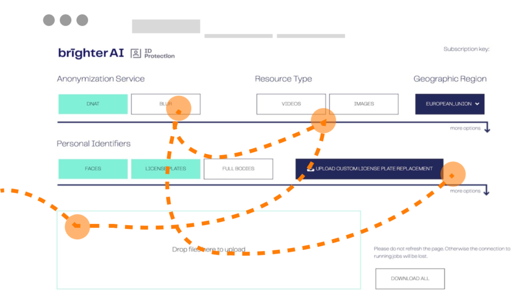
As you can see in the illustration, the UI was based on two main elements:
the configuration pane (top section) and the dropdown input (the bottom section).
The original intention behind this UI design was for users to first configure the type of anonymization and then upload files using a dropbox area. The files would automatically start processing based on the selected configuration. Once the loading bars for each file were completed, users could asynchronously download each file by clicking on the tertiary buttons that appeared on the images in the drag-and-drop area.
Relying on my intuition and previous experience with similar interactions, I could identify the reasons for the low completion rate even before testing with users. The current UI demanded too many tasks and required users to focus on multiple areas simultaneously. To confirm my hypothesis, I conducted a series of user tests to better understand user needs and pinpoint how the UI was falling short.
My hypothesis was confirmed when I observed users first uploading their images, only to later discover cryptic checkboxes and dropdowns. They would adjust these settings, expecting the already uploaded files to respond to the new configuration.
Features that are difficult to understand
Beyond the tool’s intricate layout, users faced additional challenges within the configuration section.
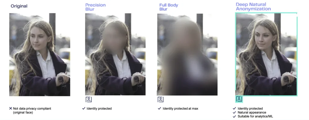
brighter AI provides an anonymization feature that maintains attributes like facial expression, ethnicity, and age. These details are crucial for future model training. However, this functionality demands clear explanations for newcomers. When applying this option to images and videos, users cannot visually distinguish between the anonymized and original content.
As indicated in the user interface, the anonymization feature is poorly described and lacks context. Users are forced to experiment to understand its effects, often leading to confusion due to the subtle changes in the processed images.


Let’s work together on your
next web project
Send a message and let’s start shaping the future of your product.