A UX APPROACH TO SIMPLIFYING COMPLEX PROCESS VISUALIZATIONS

Identifying the Business Problem
Former Users & UI Iterations
The former users on the Lana Labs platform were process mining specialists, and their insights were crucial in refining our UI. In an interview with Jonas from the customer success team, I discovered that the most frequently used filter to simplify the process diagram was the groups of variants slider.
Understanding the Concept:
- Variant: A specific sequence of activities within a case.
- Groups of Variants: Multiple variants that share a similar frequency.
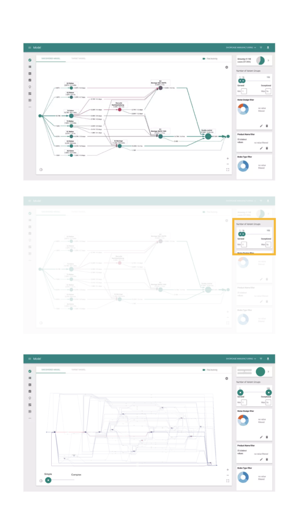
The slider was designed so that its left segments displayed fewer variants per group—highlighting the most frequent paths—while the right segments showed less frequent paths within larger groups. This allowed the team to easily switch between dimensions and explain the overall process more effectively.
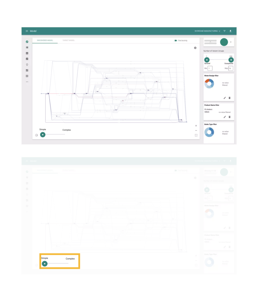
However, I observed that while the concept was intuitive for experts, it could be confusing for new users unfamiliar with process mining. In contrast, the simple/complex slider was not well understood by the customer success team, resulting in little to no usage.
After some experimentation, I confirmed with a backend developer that this slider merely hid less frequent activities to simplify the diagram further.
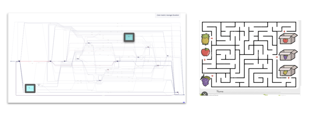
The Process HQ, users wanted to see the full complexity of their processes at first glance. Many beta customers complained that the full view felt like navigating a maze.
Drawing inspiration from Google Maps—where the level of detail adjusts to the user’s context—I saw potential in this simplification algorithm to offer a more intuitive overview of complex processes. I shared these insights with Frank Li, the Product Owner of the Process Mining team, and collaborated with Brett Blue from infoDevs to reframe the slider’s functionality in language that resonated with our users.
This iterative process not only refined our approach to simplifying the process diagram but also laid the groundwork for future enhancements aimed at balancing clarity and complexity for all users.
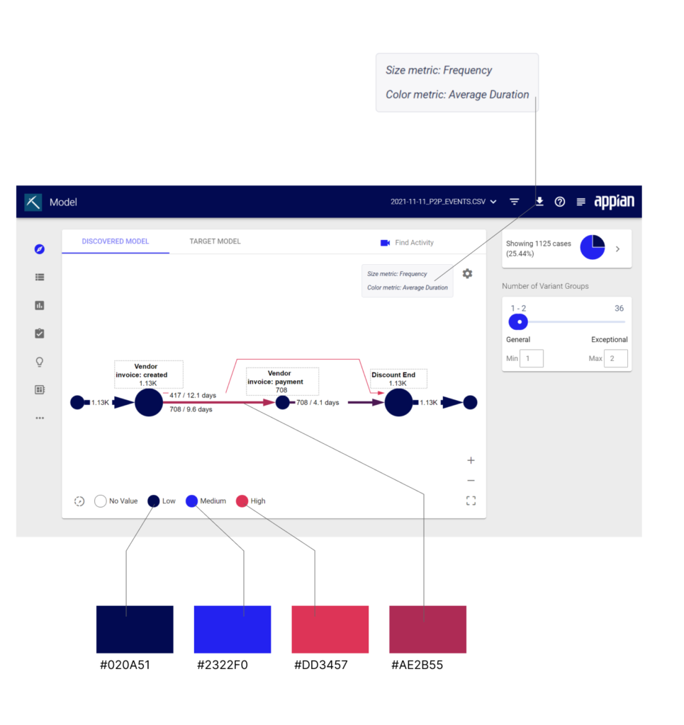
Another challenge our process mining users faced was with the legend. The references to color and size weren’t immediately clear. We only saw two colors in the legend (red and blue), but a closer look at the diagram revealed additional hues that weren’t accounted for. It took users 1–2 minutes to figure out that blue indicated the fastest cases, red represented the slowest, and any mixed color fell somewhere in between.
Additionally, the legend’s configuration was overly granular. The modal labels—like “Size = Count” and “Color = Average Case Duration”—came off as cryptic and disconnected from the overall context. Users had a hard time understanding what they were actually adjusting.

Alex Yu
Technology Strategy | Go-To-Market at Appian
“Javier is a fantastic collaborator – both an astute listener and a creative designer, able to take ideas and fly with them.”


Let’s work together on your
next web project
Send a message and let’s start shaping the future of your product.