Over the six months, I’ve had the privilege of participating in the Shift Nudge course alongside a group of UX Designers from Appian. I invite you to explore the final project I developed during this course, which showcases how I applied the knowledge and skills acquired throughout the program to improve the registration system from Berlin.

Identifying The Problem
A personal Project during The course Nudge UX
For this project, I’ll be describing how I designed a proposal for the redesign of the official webpage to request an appointment for the flat registration of Berlin. This was the outcome of the final project that I presented for the Shift Nudge Course that I attend throughout last year.
Whether you’re looking for a better apartment or your lease is ending, moving can be a tedious process. From finding a new place to packing up and arranging transportation for all your belongings, it’s definitely a task that demands a high cognitive load.
On top of this stress, things can get even more challenging if you live in Berlin. You’re probably familiar with how tedious the bureaucratic processes in Germany can be, and the registration process is no exception.
Every time you move to a new apartment, you’re required to officially register it within 14 days of moving in. You’d expect the official Berlin website to make this process straightforward, but trust me, it’s been a hassle every time I’ve had to register my new address.
This issue has become quite personal for me after living in Berlin for five years and moving eight times, largely due to the ongoing gentrification problem we’re experiencing.
When I read the requirements for the final task in the Shift Nudge Academy, which called for applying all the learnings from the course, I immediately thought of this personal situation.

Understanding My Difficulties
Why is it so difficult to get an appointment?
The most common pattern to book an appointment goes like this: You search for “Berlin Anmeldung” on Google because someone at work told you that you need to do this to avoid any trouble. You click the first link that appears. A page with an overwhelming amount of text opens. You try to read it, but since it’s in German and your level is only B1, you can’t understand it, so you start looking for a button. You click what seems to be the right button and land on another page filled with more text—and something in red, along with a countdown.
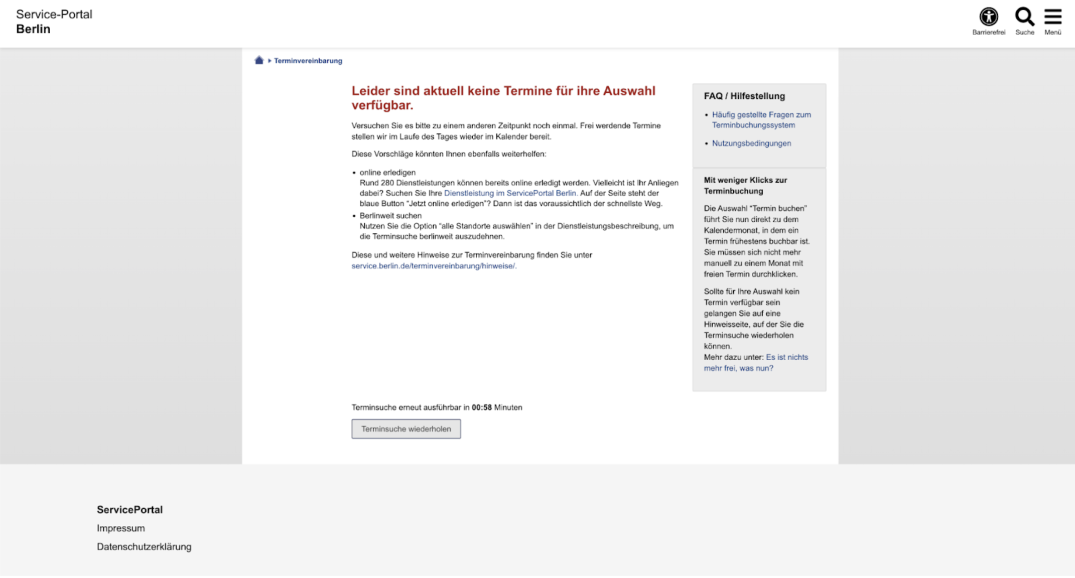
What is this? You translate the text and realize there are no appointments available. So you wait, refresh the page, and still see the same message. Frustrated, you ask knowledgeable friends on WhatsApp if they know any tricks. They suggest waking up early to check the website at 8 AM—but you have to be quick! The appointments disappear within two minutes. You set your alarm, wake up early, and, this time, skip step one because you’ve saved the page in your favorites. You finally see four appointments!
You click on the first one, only to find it’s no longer available. You go back, and luckily, one appointment is left. You click it, fill out the form, and finally get your appointment! Then, you arrive at the office, wait an hour, and, after asking why no one has called you, you’re told you don’t have an appointment because you didn’t confirm it via the email they sent.
Well, if it is about speed, the most important thing is to get your appointment. Wouldn’t it be best to optimize for that experience?

Prototyping The Desired flow
I wish I had this UI when I first came to berlin…
Analyzing the current user flow, it is clear that the 2 first steps are quite inevitable.
Analyzing the current user flow, it is clear that the 2 first steps are quite inevitable.
Looking at steps 3 through 10, I believe there’s an opportunity to mitigate user frustration. In fact, this was the goal of the activity I worked on for the Shift Nudge Course.
The current user flow assumes that users will read every detail before clicking the call to action to schedule an appointment.
If you’re a new user and unaware of how quickly these appointments can run out, you’ll likely be tempted to read the entire page—you never know with all the German specifications. But by the time you decide to click for an appointment, you may be disappointed to find there’s nothing left but to wait for the next availability.
From my experience, I believe this flow should be optimized to ensure that users can quickly secure an appointment first and then be guided through the necessary specifications afterward.
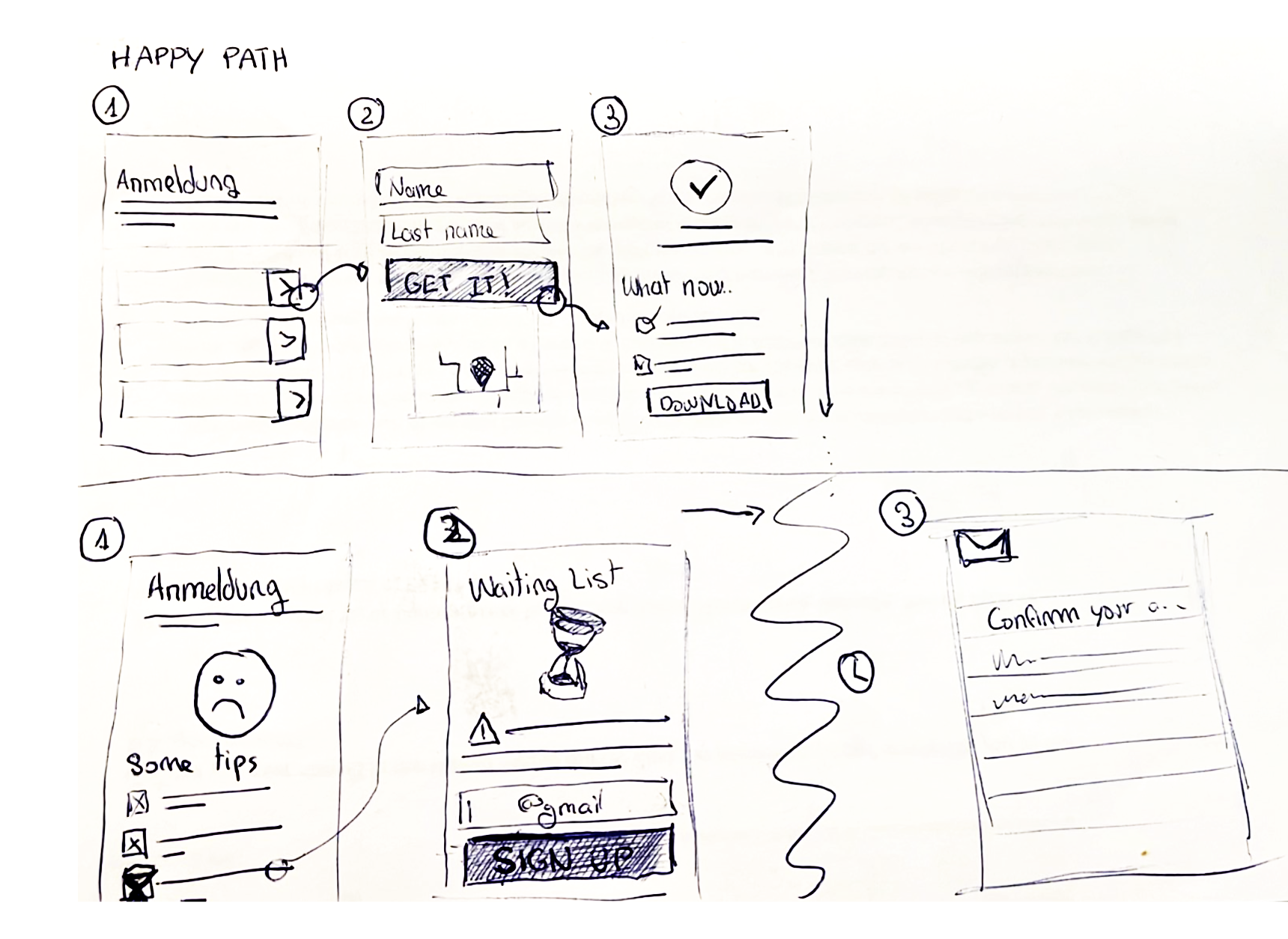
Happy Path User flow proposal:
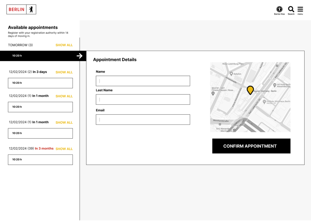
- I land on a page that quickly explains the importance of registering my Anmeldung, highlighting the key details I need to know, while simultaneously prompting me to select an appointment.
- I see the details for the appointment, including relevant information about the time and location, along with a simple form to fill out and confirm the appointment.
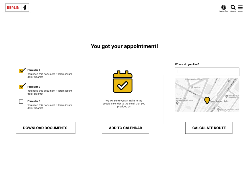
- I see a clear confirmation page that validates my booking, along with a list of the necessary documents to bring to the appointment, as well as other useful information to help me prepare for registration day.
What has been described outlines the ideal or “happy path” for the user flow. However, we must also consider common alternative scenarios and how to address them in the most intuitive way.
Unavailable Appointments If no appointments are available, I would recommend displaying a helpful screen with tips on securing an appointment faster. This could include advice on the best times to log in or, in urgent situations, alternative contact options for support. An experimental feature could even allow users to schedule appointments automatically based on their preferences.
That said, this feature could impact the process on the other end, as there’s a significant chance that users who find it too easy to book an appointment might not show up, leading to inefficiencies for the office.
Appointments Within the Hour Another issue arises for users who secure appointments at short notice. For example, a user might book a slot at 11 AM, but it’s already 10:33 AM, and it will take them at least 45 minutes to reach the office. In this case, the system should optimize the experience to prevent frustration on both sides. Providing a warning or an alternative solution would help manage expectations and prevent no-shows.
Low Fidelity Mockups
On top of optimizing the flow, I wanted to ensure the experience was seamless for mobile users, as that’s how I would personally approach it if the webpage allowed for mobile access.
It added to my frustration that whenever I tried to book an appointment on my phone, it wasn’t possible, forcing me to rush to my computer to complete the process.
Creating low-fi mockups helped me quickly visualize how the experience could unfold, saving time and keeping the focus on the overall structure rather than getting lost in the small details.
Taking a mobile-first approach also encourages simplicity. With less screen space, it’s a great exercise in segmenting the user flow into logical steps.
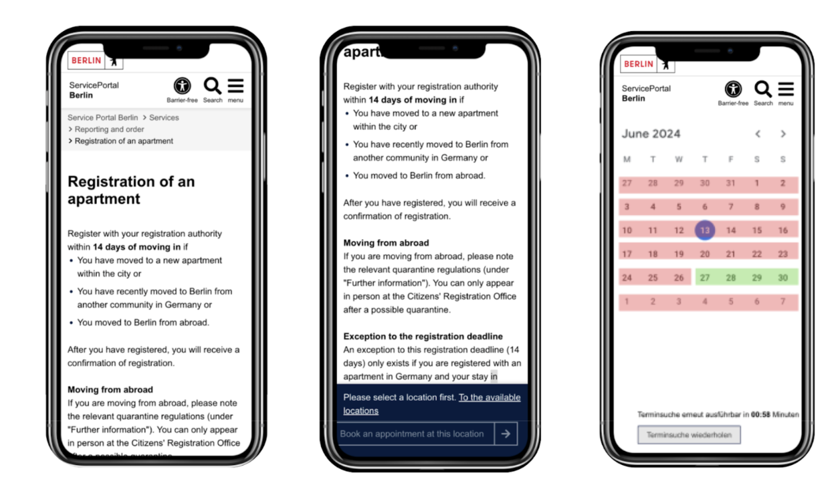
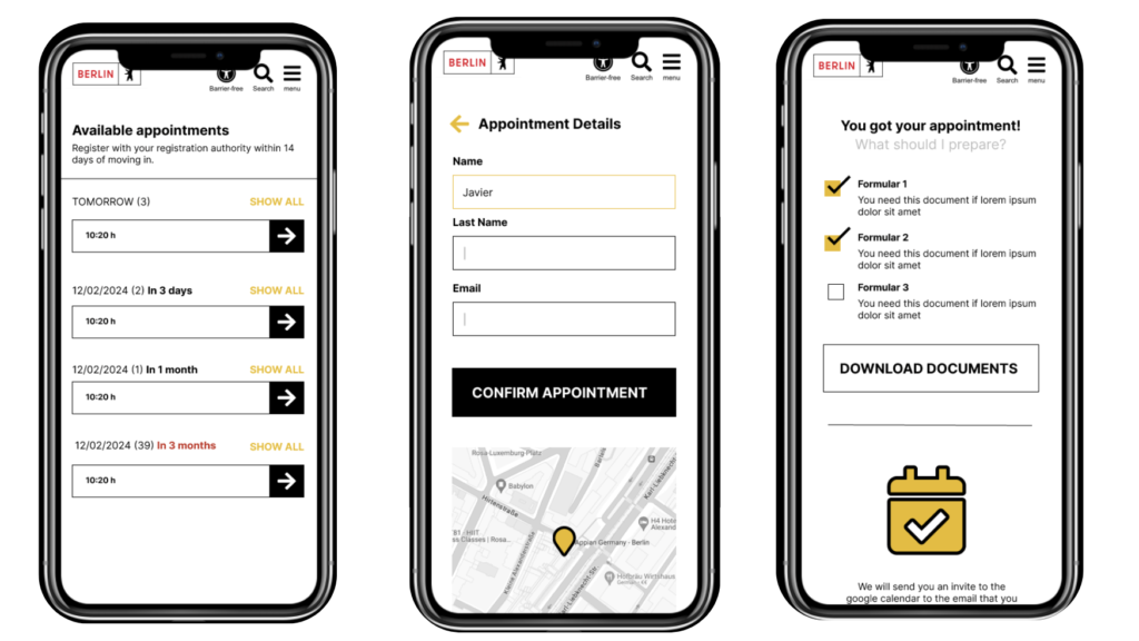
For the first screen, I chose to display a list of available appointments rather than a calendar. This makes it easier for users to select an option, as a calendar grid can be difficult to navigate on smaller screens.
After selecting an appointment, users are shown a form with only the essential fields needed to secure the appointment. Ideally, to speed up the process, I considered the option of allowing users to sign up via Google.
Once the form is completed, the user is shown a confirmation screen, making it clear that their appointment is successfully booked. At this stage, I would present the most important information, not just as plain text, but visually organized for clarity.
Naturally, this information would be arranged vertically and prioritized by relevance to ensure users have everything they need to complete the Anmeldung process successfully.
- Documents that might be relevant to download and complete with a link to more information.
- Adding an appointment to your google calendar so you don’t forget the event.
- Adding a distance calculator so you can easily know how to go and how much time it would take.
High fidelity Mockups
At this stage of the design process, I began focusing on the look and feel of the interface. I wanted to ensure that the page didn’t feel disconnected from the Berlin official branding.
In this visualization, you can see how I incorporated the colors and distinctive shapes from the Berlin logo to add personality to UI elements like text inputs, dividers, and buttons.
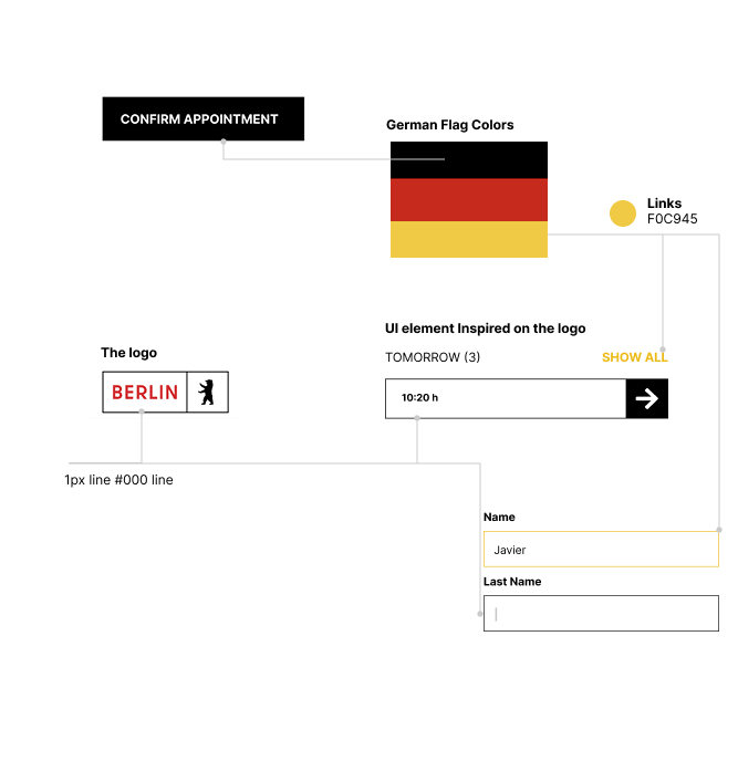
However, a critical aspect to consider when bringing branding elements into functional components is ensuring that functionality—such as affordance or accessibility—is not compromised..
Conclusions
This exercise was a fun way to put into practice all the concepts I reinforced during the Shift Nudge Course. It also made me think about how much I would love to see this interface integrated into the official Berlin website.
Let’s work together on your
next web project
Send a message and let’s start shaping the future of your product.