BUILDING BRIGHTER AI’S FIRST DESIGN SYSTEM FROM SCRATCH

MVP Definition and Implementation
By establishing reusable components, scalable design tokens, and clear guidelines, we cut production times, reduced inconsistencies, and ensured every interface aligned perfectly with our brand identity.
The impact was immediate — designers and developers could focus on creating meaningful user experiences instead of solving repetitive design problems. The system became a powerful tool for delivering polished, cohesive products faster and more efficiently.

Design Tokens
Design tokens are a way to store and manage design-related values (such as colors, typography, spacing, etc.) in a consistent and reusable manner. They are essentially a collection of variables that define the visual properties of a design system, making it easier to maintain consistency and facilitate scalability across different platforms and products.
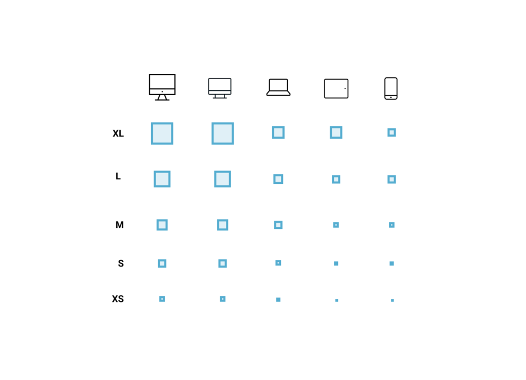
Sizes:
Sizes are used to establish consistency across all the layouts. These are used to define the paddings, margins, and size of interface elements as icons or containers
| Size | Value | Description |
| –size-XL | 4rem (64px) | Extra-large elements (hero sections, big containers) |
| –size-L | 3rem (48px) | Large elements (titles, primary containers) |
| –size-M | 2rem (32px) | Medium elements (content sections, buttons) |
| –size-S | 1.5rem (24px) | Small elements (secondary components) |
| –size-XS | 1 rem (16px) | Extra-small elements (labels, spacing) |
export const theme = {
  sizes: {
    xl: '4rem', // 64px
    l: '3rem', // 48px
    m: '2rem', // 32px
    s: '1.5rem', // 24px
    xs: '1rem', // 16px
  },
} as const;

// Optional: Type for the theme object
export type Theme = typeof theme;
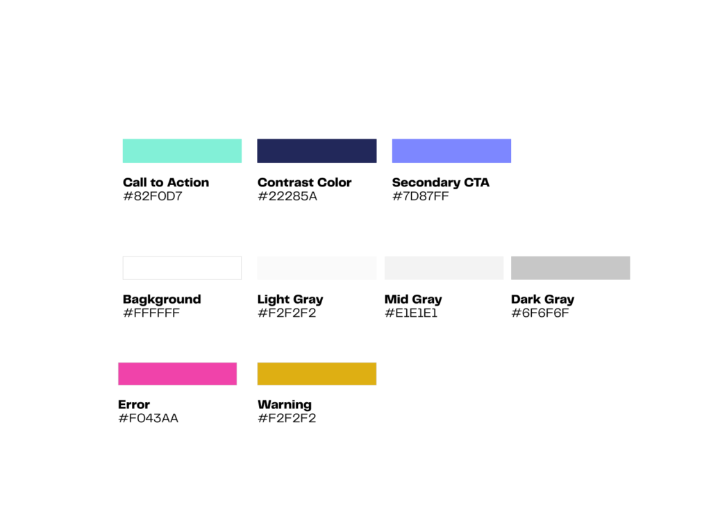
Color Palette
Using color tokens ensures consistency across the user interface and provides a strong foundation for creating accessible and visually appealing designs. Below are key color tokens defined for various purposes:
Grays for Accessible Container Backgrounds
Gray tones play a key role in defining container sections and interface structures.
They are carefully selected to ensure readability and subtle visual separation without overwhelming the user.
- Light Gray (–color-container-light-gray): Provides a gentle background for cards, forms, or secondary sections while maintaining a clean layout.
- Mid Gray (–color-container-mid-gray): Slightly darker tone used for separation between primary and secondary content areas.
Both colors are chosen to maintain contrast and ensure the design remains AAA accessible for text readability.
Accessibility (AAA Compliance) for Secondary Text
The color for secondary text (#6F6F6F) meets WCAG AAA standards for contrast against light backgrounds, making it suitable for captions and metadata without sacrificing readability. This ensures your designs are more inclusive and user-friendly for all audiences.
Usage Guidelines
- Call to Action (–color-primary): Use for primary buttons and interactive elements to guide user actions.
- Containers (–color-container-light-gray and –color-container-mid-gray): Apply to cards, panels, and sections requiring subtle differentiation.
- Error (–color-error): Apply sparingly for alerts and destructive actions.
- Success (–color-success): Reinforce confirmation messages with this color.
By adhering to these design token guidelines, you ensure a harmonious, accessible, and maintainable color system across digital products.
export const colors = {
  // Primary Colors
  callToAction: '#82F0D7',
  contrastColor: '#22285A',
  secondaryCTA: '#7D87FF',

  // Background Colors
  background: '#FFFFFF',
  lightGray: '#F2F2F2',
  midGray: '#E1E1E1',
  darkGray: '#6F6F6F',

  // Status Colors
  error: '#F043AA',
  warning: '#F2F2F2',
} as const;

// Optional: Type for the colors object
export type Colors = typeof colors;
)
Borders & Radii
In accordance with Brighter AI’s brand guidelines, all borders will maintain a sharp, no-radius style to preserve the clean and structured design aesthetics already established on the webpage. This decision reinforces a sleek and professional appearance, ensuring brand consistency across all UI elements.
- Standard Border Size (–border-size-default): 1px
- Used for input fields, cards, and containers that require subtle definition.
- Bold Border Size (–border-size-bold): 2px
- Applied to components like buttons or active states for emphasis.
- Maintain clean, sharp edges without radius on all components.
- Use the 1px standard border for most UI elements and apply the 3px bold border sparingly for emphasis on active states or critical elements.
- Ensure contrast and clarity by leveraging appropriate color tokens based on user states and functionality.
By adhering to these principles, the design will remain visually aligned with Brighter AI’s minimalist and structured brand identity while enhancing usability and accessibility.
export const borders = {
  // Border Sizes
  sizeDefault: '1px', // Standard border
  sizeBold: '2px', // Bold border

  // Border Radius (sharp edges, no radius)
  radiusNone: '0', // Sharp edges

  // Border Styles
  styleNone: 'none', // No border
  styleSolid: 'solid', // Solid border
} as const;

// Utility Classes
export const borderUtilities = {
  borderNone: 'border-none', // Class for no border
  borderSolid: 'border-solid', // Class for solid border
};
Atoms (Basic UI Elements)
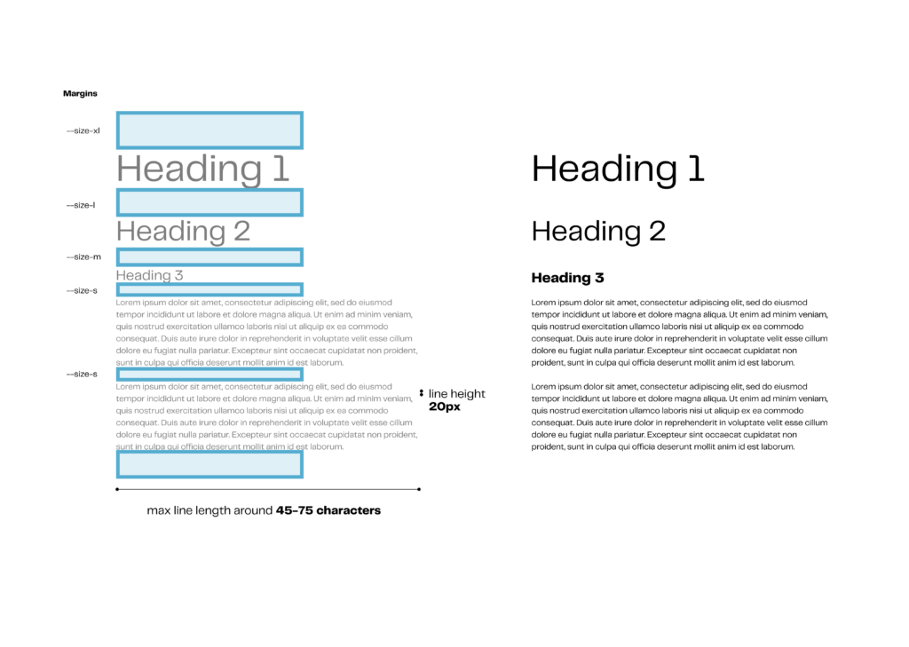
Typography:
General guidelines
| Font Size | Color | Weight | Size |
| Heading 1 | –contrast-color | Regular | 4rem (64px) |
| Heading 2 | –contrast-color | Regular | 3rem (48px) |
| Heading 4 | –contrast-color | Bold | 1.5rem (22px) |
| Body Text | –contrast-color | Regular | 0.85 rem (14px) |
| Descriptions | –dark-gray | Regular | 0.85 rem (14px) |
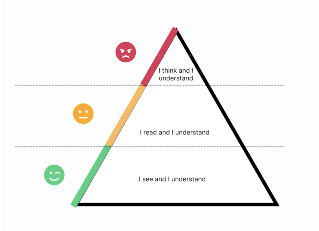
Typography in Brighter AI’s anonymization software serves two primary functions:
- Communicating Information:
Clear and concise text that guides users through anonymization tasks, informs them of system status, and communicates success/error messages. - Establishing Hierarchy:
Text size, weight, and placement help users quickly understand what actions are primary, secondary, and supportive.
Design Principles
- Minimal Cognitive Load:
Do not rely heavily on typography to explain the interface.- Goal: The interface should be self-explanatory through its layout, colors, and icons.
- Why: Overloading users with text increases cognitive effort and reduces task efficiency.
- Consistent Hierarchy:
Maintain a predictable type hierarchy to guide users naturally.- Headlines (H1–H3): For section headings and important page titles.
- Body Text: For supporting instructions and descriptions.
- Labels: Directly associate input labels with fields for clarity.
- Accessibility:
- Use WCAG-compliant font sizes and ensure contrast with backgrounds (4.5:1 for body text).
- Avoid relying solely on font weight or color to convey meaning.
/* Heading 1 */
.heading-1 {
  color: var(--contrast-color); /* Use your contrast color variable */
  font-weight: 400; /* Regular */
  font-size: 4rem; /* 64px */
  line-height: 1.2; /* Adjust as needed */
}

/* Heading 2 */
.heading-2 {
  color: var(--contrast-color); /* Use your contrast color variable */
  font-weight: 400; /* Regular */
  font-size: 3rem; /* 48px */
  line-height: 1.3; /* Adjust as needed */
}

/* Heading 4 */
.heading-4 {
  color: var(--contrast-color); /* Use your contrast color variable */
  font-weight: 700; /* Bold */
  font-size: 1.5rem; /* 22px */
  line-height: 1.4; /* Adjust as needed */
}

/* Body Text */
.body-text {
  color: var(--contrast-color); /* Use your contrast color variable */
  font-weight: 400; /* Regular */
  font-size: 0.85rem; /* 14px */
  line-height: 1.5; /* Adjust as needed */
}

/* Descriptions */
.description-text {
  color: var(--dark-gray); /* Use your dark gray variable */
  font-weight: 400; /* Regular */
  font-size: 0.85rem; /* 14px */
  line-height: 1.5; /* Adjust as needed */
}
Best Practices
Keep Text Short & Action-Oriented:
- Example: Replace “To start the anonymization process, please click this button” with “Start anonymization.”
Avoid Walls of Text:
Use bullet points or cards to break information into digestible chunks.
Buttons
General guidelines
Primary Buttons
- Purpose: Main actions (e.g., submitting forms, confirming actions).
- Variants:
- Small: For compact spaces (e.g., tables, modals).
- Medium: Default size for most use cases.
- Large: For prominent calls-to-action (e.g., hero sections).
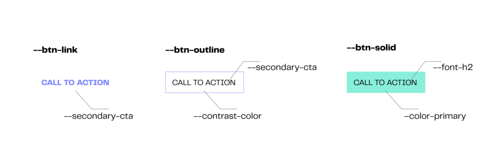
Secondary Buttons
- Purpose: Secondary actions (e.g., cancel, back).
- Variants:
- Link: Text-based buttons for less prominent actions.
- Outline: Buttons with a border and transparent background.
- Solid: Filled buttons for secondary actions.
Accessibility Considerations
- Color Contrast:
- Ensure text and background meet WCAG 2.1 AA standards (≥ 4.5:1).
- Use
--color-primaryfor primary buttons and--contrast-colorfor outlines.
- Focus States:
- Add a 2px outline (
--color-primary) on:focusfor keyboard navigation.
- Add a 2px outline (
- ARIA Labels:
- Use
aria-labelfor buttons with only icons or ambiguous text (e.g., “CALL TO ACTION”).
- Use
- Disabled States:
- Use
opacity: 0.6andcursor: not-allowedfor disabled buttons.
- Use
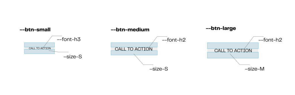
.btn-small {
  font-size: var(--font-h3);
  padding: 8px 16px;
  height: 32px;
}

.btn-medium {
  font-size: var(--font-h2);
  padding: 12px 24px;
  height: 40px;
}

.btn-large {
  font-size: var(--font-h2);
  padding: 16px 32px;
  height: 48px;
}

.btn-primary {
  background-color: var(--color-primary);
  color: white;
}

.btn-primary:hover {
  background-color: darken(var(--color-primary), 10%);
}

/* Descriptions */
.description-text {
  color: var(--dark-gray); /* Use your dark gray variable */
  font-weight: 400; /* Regular */
  font-size: 0.85rem; /* 14px */
  line-height: 1.5; /* Adjust as needed */
}
Organisms
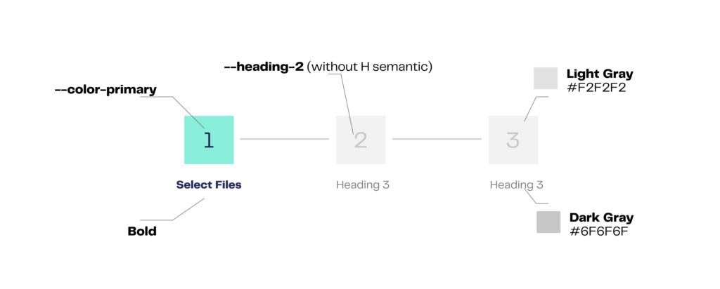
Stepper Component
The Stepper component is used to guide users through a multi-step process, such as file uploads, form submissions, or onboarding flows. It visually represents progress and helps users understand their current position within a sequence of steps.
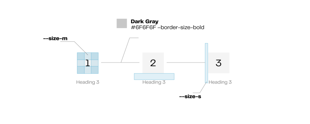
Implementation Specifications
Structure:
- Use the Material-UI Stepper component as the base (
https://mui.com/material-ui/react-stepper/). - Each step should include a label (e.g., “Select Files”) and an optional description for additional context.
Styling:
- Border Color: Dark Gray (
#6F6F6F) for step connectors. - Border Size: Bold for step connectors.
- Text:
- Step labels: Use Heading 3 with
--size-sfor consistent sizing. - Active step: Apply
--color-primaryto highlight the current step.
- Step labels: Use Heading 3 with
Behavior:
- Steps should be clickable for navigation (if applicable).
- Ensure the stepper is responsive and adapts to smaller screens by collapsing labels or using a horizontal scroll.
/* Override the Stepper root styles */
.MuiStepper-root {
  background-color: #F2F2F2; /* Light Gray */
  padding: 16px;
  border-radius: 0; /* Remove rounded corners */
}

/* Override the Step icon container styles */
.MuiStepIcon-root {
  color: #6F6F6F; /* Dark Gray */
  border-radius: 0; /* Remove rounded corners */
}

.MuiStepIcon-active {
  color: #6F6F6F; /* Dark Gray */
  border-radius: 0; /* Remove rounded corners */
}

.MuiStepIcon-completed {
  color: #6F6F6F; /* Dark Gray */
  border-radius: 0; /* Remove rounded corners */
}

/* Override the Step connector styles */
.MuiStepConnector-line {
  border-color: #6F6F6F; /* Dark Gray */
  border-radius: 0; /* Remove rounded corners */
}

/* Override the Step label styles */
.MuiStepLabel-label {
  color: #6F6F6F; /* Dark Gray */
  font-weight: bold;
  border-radius: 0; /* Remove rounded corners */
}

.MuiStepLabel-active {
  color: #6F6F6F; /* Dark Gray */
  border-radius: 0; /* Remove rounded corners */
}

.MuiStepLabel-completed {
  color: #6F6F6F; /* Dark Gray */
  border-radius: 0; /* Remove rounded corners */
}

/* Override the Button styles */
.MuiButton-root {
  color: #6F6F6F; /* Dark Gray */
  border-color: #6F6F6F; /* Dark Gray */
  border-radius: 0; /* Remove rounded corners */
}

.MuiButton-contained {
  background-color: #6F6F6F; /* Dark Gray */
  color: #FFFFFF; /* White */
  border-radius: 0; /* Remove rounded corners */
}

.MuiButton-outlined {
  border-color: #6F6F6F; /* Dark Gray */
  border-radius: 0; /* Remove rounded corners */
}

/* Override the Typography styles */
.MuiTypography-root {
  color: #6F6F6F; /* Dark Gray */
  border-radius: 0; /* Remove rounded corners */
}

.MuiTypography-caption {
  color: #6F6F6F; /* Dark Gray */
  border-radius: 0; /* Remove rounded corners */
}
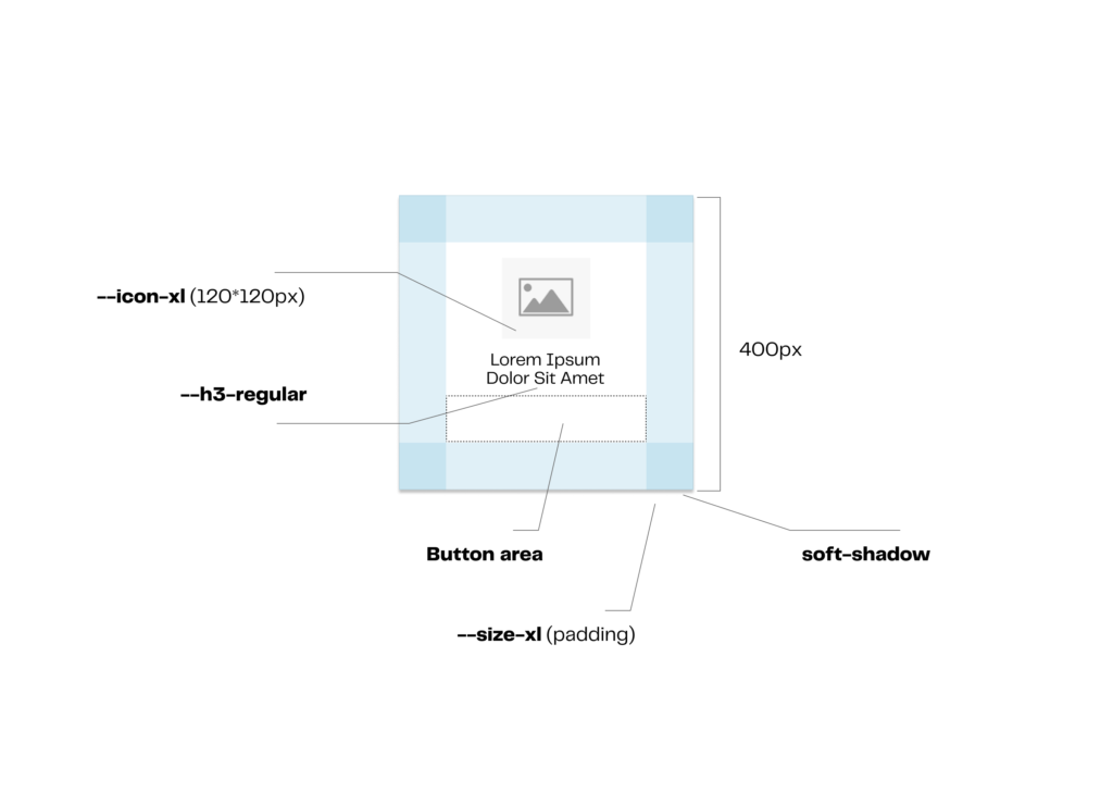
General Container Component Guidelines
The General Container is a versatile component used to group and display content, such as text, icons, or other UI elements. It provides a structured layout with consistent spacing and visual hierarchy.
Implementation Specifications
- Structure:
- Width recommendartion:
400px. - Icon (
icon-xl–120x120px) at the top. - Supports text content (e.g., “Lorem Ipsum”) with proper padding.
- Optionally add buttons with the main interaction.
- Width recommendartion:
- Styling:
- Shadow: Soft shadow for depth (
soft-shadow). - Padding:
size-xlfor consistent internal spacing. - Background: Neutral background color to ensure content stands out.
- Shadow: Soft shadow for depth (
Accessibility Considerations
- Contrast: Ensure text and icons meet WCAG AA contrast ratios (4.5:1).
- Focus States: Add a visible focus indicator for interactive containers.
- Screen Reader Support: Use
aria-labelfor containers with non-text content.
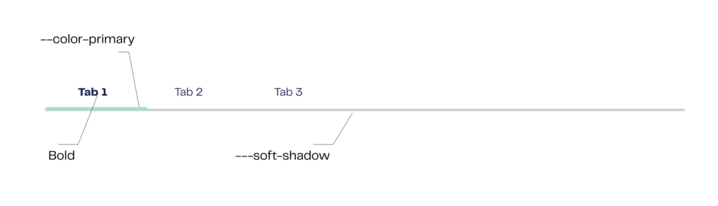
Tabs Component Guidelines
The Tabs component organizes content into distinct sections, allowing users to switch between views without leaving the page. Customized for Brighter AI, it aligns with the brand’s visual language while ensuring clarity and accessibility.
Implementation Specifications
Base Component: MUI Tabs (Source).
Customizations for Brighter AI:
- Active Tab Styling:
- Text Color: Use
--color-primaryfor the active tab label. - Indicator Line: Apply
--color-primary(replaces MUI’s default secondary color). - Font Weight: Bold for active and inactive tabs to match Brighter AI’s typography guidelines.
- Text Color: Use
- Inactive Tab Styling:
- Text Color: Dark Gray (
#6F6F6F). - Hover State: Add a subtle background color (e.g.,
#F5F5F5).
- Text Color: Dark Gray (
- Spacing:
- Padding: Use
--size-mfor horizontal and vertical padding.
- Padding: Use
Redesigning an AI face redaction tool
One of my key projects demonstrates how I applied Lean UX principles to redesign the main interface of the startup Brighter AI, an innovative startup focused on AI-based anonymization technology.
Learn how I help the development team implemented the design system that I built from scratch.

Thomas Strottner
VP at Edgeless Systems
“Working with Javier was a game-changer for our brand presence. He seamlessly balanced creativity and strategic thinking to help update the Brighter AI website while maintaining consistent brand guidelines.”


Let’s work together on your
next web project
Send a message and let’s start shaping the future of your product.