A UX APPROACH TO SIMPLIFYING COMPLEX PROCESS VISUALIZATIONS

Research Solutions and Hypothesis Proposal
Research and Evaluation
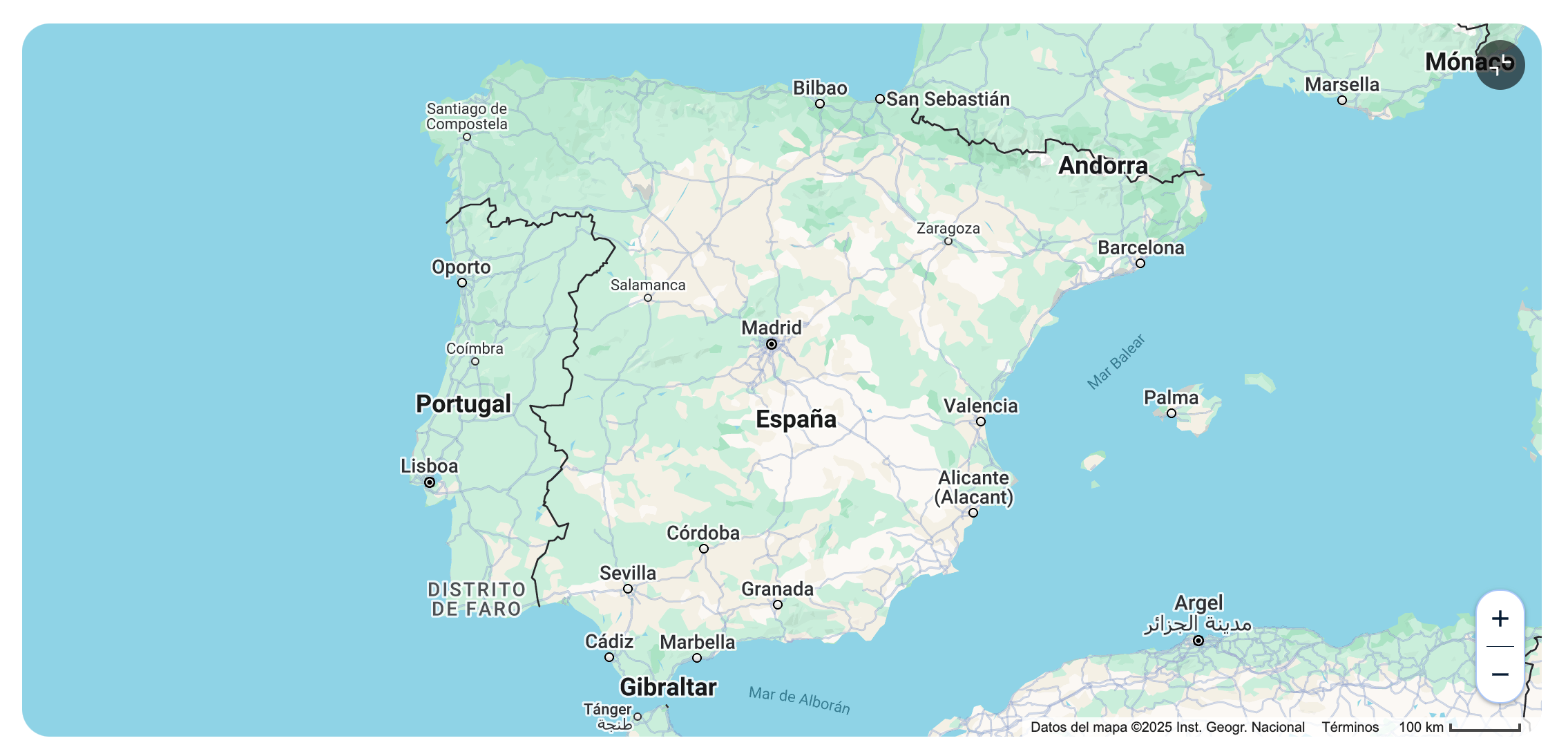
I started by drawing an analogy with Google Maps. Imagine looking at a map of Spain—you see the country’s overall layout with key data points relevant to that scale. It wouldn’t make sense to display every street name when viewing such a vast area, right? Google Maps smartly adapts its level of detail based on what you need at that moment.
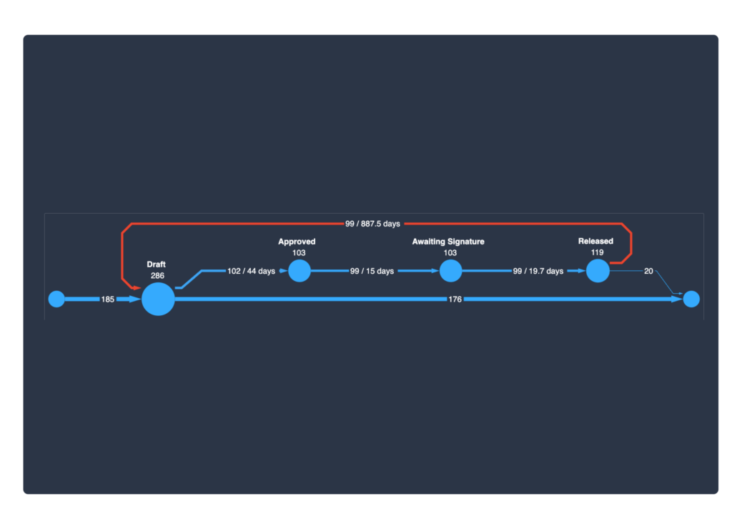
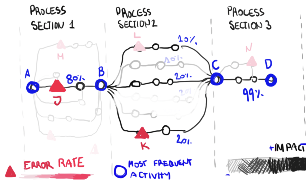
Similarly, in our simplified process diagram, we currently display the most frequent activities to give users a clear overview. However, there’s a missing piece: signifiers that indicate additional, less frequent activities are hidden from view.
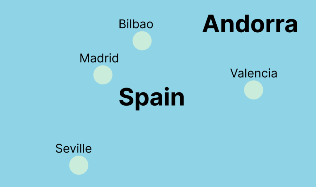
The closest to what we’re doing with the process diagram is shown in the following image. While we display some of the most relevant elements of Spain, we completely lose the context—there’s no abstraction or visual hint to help users understand the overall structure of the country.
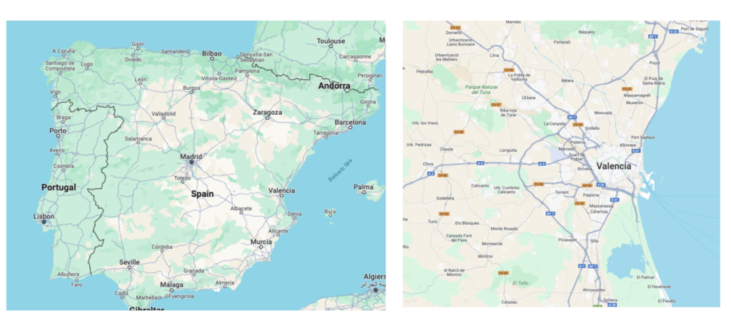
When you zoom in on a specific city in Spain, Google Maps re-renders the information to show more details that are relevant at that level. This concept of progressive disclosure is key. Our challenge was to apply a similar logic to the process diagram—providing a high-level snapshot that doesn’t overwhelm, yet invites users to explore further when they need more granular insights.
Hypothesis:
By clarifying the functionality and improving progressive disclosure within the process diagram, users will be encouraged to drill down into additional details. This approach will not only enhance their understanding of complex processes but also lead to a more engaging and interactive experience.
Proposed Solutions:
- Enhanced Visual Cues: Introduce subtle indicators that signal when additional data is available. These cues will help users understand that the displayed view is a simplified overview and that more details can be uncovered on demand.
- Adaptive Rendering: Borrowing from the Google Maps approach, implement an adaptive interface where the diagram progressively reveals more details as users zoom in or interact with specific segments. This way, the initial view remains uncluttered while still offering a realistic overview of the overall process complexity.
- User Education: Integrate brief, in-context explanations or tooltips that clarify how the diagram works. This will reduce confusion for users new to process mining while empowering experts with the right information at the right time.
- Feedback Mechanisms: Incorporate user feedback loops to continuously refine how progressive disclosure is implemented, ensuring the experience aligns with user expectations and real-world use cases.
By testing these solutions, we aim to validate that a well-designed progressive disclosure mechanism not only simplifies the initial view but also encourages users to engage more deeply with the process diagram—much like how users intuitively interact with Google Maps for both broad and detailed perspectives.


Let’s work together on your
next web project
Send a message and let’s start shaping the future of your product.